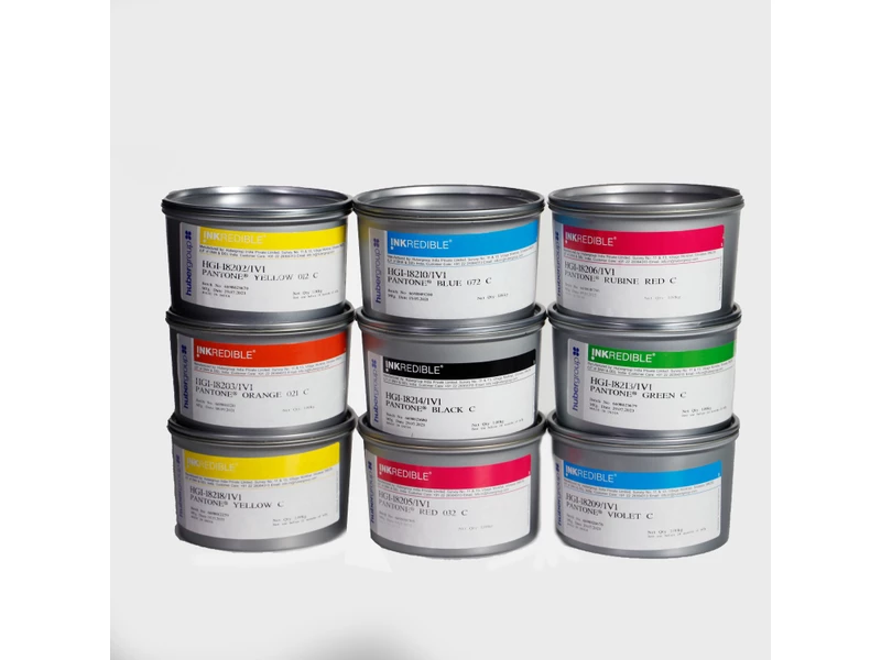
hubergroup
PANTONE Colour Matching System
The PANTONE® color matching system is marketed world-wide by its developer and is used
as the basis for a great many special colours. The bases of this system are the 13 basic
PANTONE® colours, plus a black and a transparent white. Thanks to the 1,114 different
mixed colours on coated and uncoated paper, the system has now become more and more
important with regard to proprietary articles, CI etc.
The PANTONE® formula guide is structured in accordance with the following system:
On the basis of the 13 basic colours, approximately 160 mixing formulae (mid-tone in the
PANTONE® colors gamut) are generated and produced as solids.Each of these formulae was
on the one hand brightened using three different quantities of transparent white (moving up
the gamut) and on the other hand grayed with black (moving down the gamut) .
These mixed colors are proofed on a special letterpress press and printed on two different
materials.
C = coated material
U = uncoated material
Each year, PANTONE® publishes 2 editions of its formula guide.
This results in the following situation:
1. Strength of colour of the colour guide
A number of the colour shades in the PANTONE® colour guide are proofed with a
high film thickness that can not be achieved with just a single pass on an offset press,
e.g. PANTONE® Green and Blue 072. The shade can only be reproduced by
conducting two passes.
2. Fastness properties
Many mixed inks have been formulated using basic colours that have a low light
fastness rating and are also neither solvent- nor alkali- resistant.
Some of these basic colours are also used in very low concentrations. This leads to
the colour shade produced having an extremely low light fastness (e.g. 227 C, 406 C,
427 C, and 434 C etc). In order to obtain higher light fastness values, these formulae
must be mixed using basic colours with higher fastness ratings.
To enable subsequent finishing with UV varnish or film laminating, the inks must be
solvent and alkali-resistant, but this too can only be achieved by using special basic
colours with better fastness properties.
Compared with the pigments in use, pigments with higher fastness values differ with
respect to their colorimetrics. Consequently, differences in colour shade and/or
metamerism are inevitable.
3. Substrate
When formulating and conducting quality inspections, the Huber group uses a paper
whose whiteness is as close as possible to that of the paper used for the colour guide.
Prints made on a substrate that differs from the colour guide paper, i.e. print run stock,
therefore produce variations in shade.
For exact shade matching we always recommend to provide the original substrates on
which the match shades to be printed.
4. Differences between C and U
In the PANTONE® formula guide system, the same colour with identical formula is
printed on coated and uncoated paper. The formula is not adapted in order to match
up the coloristics (shade and purity) of the colour on the two stocks.
As a result, differences can be detected between some mixed colours when printed on
C and U.
5. Finishing
The PANTONE® formula guide presents the colours without surface finishing. Post
print finishing (varnishing, lamination) usually leads to a change in the colour shade.
This is technically unavoidable and can not be counteracted by modifying the formula
either